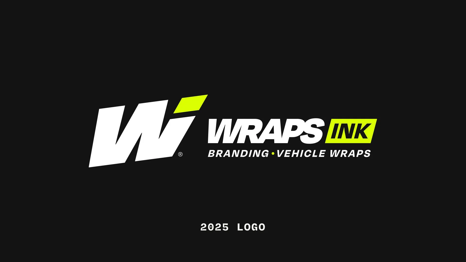
Updating the Wraps Ink Brand, to Better Serve Yours.
Like with many brands, over the years what Wraps Ink is has gradually evolved. We’ve been around for over 20 years now, and over that time things do change. Our team size has expanded considerably, we now have a second location, and both the quality and breadth of our services have equally increased. It’s time we made some changes to reflect this growth, and we are rolling out a refreshed logo and visual identity to better reflect where we are headed.
Where We Started
In our 20+ year history as a company, Wraps Ink has experimented with a number of different services and areas of focus. Early on, prior to The Great Recession, we had a big focus on providing graphics and graphics installation for race car teams. We’ve done hand-painted signage. We have even dipped our toes into web design and SEO. But for the past decade, we’ve really found our lane and made a name for ourselves when it comes to commercial vehicle wraps, mainly for home service companies. That has been our bread and butter, and still is.
During this time we noticed something. These small business owners are constantly shuffled between multiple vendors to get things made. They have a “wrap guy,” a “shirt guy,” a “logo guy,” a “business card guy,” etc., and usually their brand suffers for it, even if they don’t realize it. Often each vendor will try to put their own spin on the brand using different fonts, different colors, tweaking your logo, etc., resulting in a lack of any true consistency for the brand. This is made that much worse for companies that don’t have their brand professionally designed with a brand style guide to follow.
These home service companies and small businesses deserve better. They deserve a one-stop shop, tailored to them, that has the design and branding expertise of a large creative agency, combined with the capability to produce and install any of their branded materials they would get from a typical wrap or sign shop.


Why We Made a Change
Clarity
The issue was that our current brand no longer reflected this direction we’ve been heading. Even though we’ve been gradually shifting to position ourselves as something closer to a full-service creative agency, even many of our existing clients still assumed we were just “the wrap guys.” Yes, we will still crush any wrap job they have, but our brand’s visual identity and messaging needed to be adjusted to more clearly communicate that we should also be the ones to turn to when they need to rebrand, get company uniforms designed, have print collateral made, etc.
If we are positioning ourselves as an authority figure in design, this means we have to do some introspection and get our own house in order too. Part of the goal with this brand refresh was to bring our own company up to the standard of work we have been putting out to our branding clients.
Accessibility
This was a key area of focus when we put our brand under the microscope. The logotype, or the text portion, of the previous Wraps Ink logo had this very tightly kerned look to it. It was visually interesting, but also very difficult to read or reproduce at smaller sizes due to the typeface it was built from.
Color was another area we needed to bring up to code, so to speak, for improved accessibility. Previously, a pure black color was one of our primary brand colors, but when combined with pure white text, it is an extremely harsh combination on the eyes, causing eye strain when reading large bodies of text on screens.
Differentiation
With any branding project, taking a look at your peers and competitors is always necessary to figure out how to best carve out your own lane. What we discovered was that a lot of the players in the home service branding space have been using similar brand fonts as one another, including Wraps Ink by complete coincidence. But part of our brand promise is that we aren’t like all the other guys. We just needed to better communicate that visually.


What This Means For Our Clients
If you are currently a client of Wraps Ink, you don’t have to worry. There are no changes or reductions to the service or quality of your service coming. All this brand refresh means for you as a client is that we will more clearly communicate the nature of the services we offer.
And that’s really what this is, a refresh and refinement of who we are, not a total rebrand. We’re still the same company we’ve always been when it comes to being the vehicle wrap experts. That will never change. The difference now is that, to better serve our clients, we’ve built out other important pillars of our business that are at that same industry-leading quality bar, and our visuals and messaging will better communicate that.
Drive Your Brand Forward
If you need to update your own company’s brand, you found the right team for the job. You can give either of our offices a call, or send us an email to start a conversation about your project.
Murrells Inlet Office: 843.651.6003
Charleston Office: 843.823.9274
Email: sales@wrapsink.com